OOBE App Discovery
Four experiments to make app recommendations on a brand-new Android phone worth the tap.
AppLovin's discovery SDK runs inside the first-run setup of new Android phones, shipping with OEM and carrier partners such as Samsung and T-Mobile, plus partners across Europe. I ran a ladder of experiments on the app recommendation step, so more users would engage with it and complete installs, without adding real friction to device setup. At this scale, even small metric shifts translate into meaningful impact.
- Experience design for all four experiment tracks
- Survey, bundle and swipe flow design
- Metric definition with data analysis
- Iteration on live funnel results
- Design Lead, strategy and partner alignment
- Product Designer (me)
- Data Analyst
- Engineering team
Confidentiality note: the screens, copy, app lists and absolute numbers on this page are sanitized placeholders. Only the uplift percentages come from the real experiments.
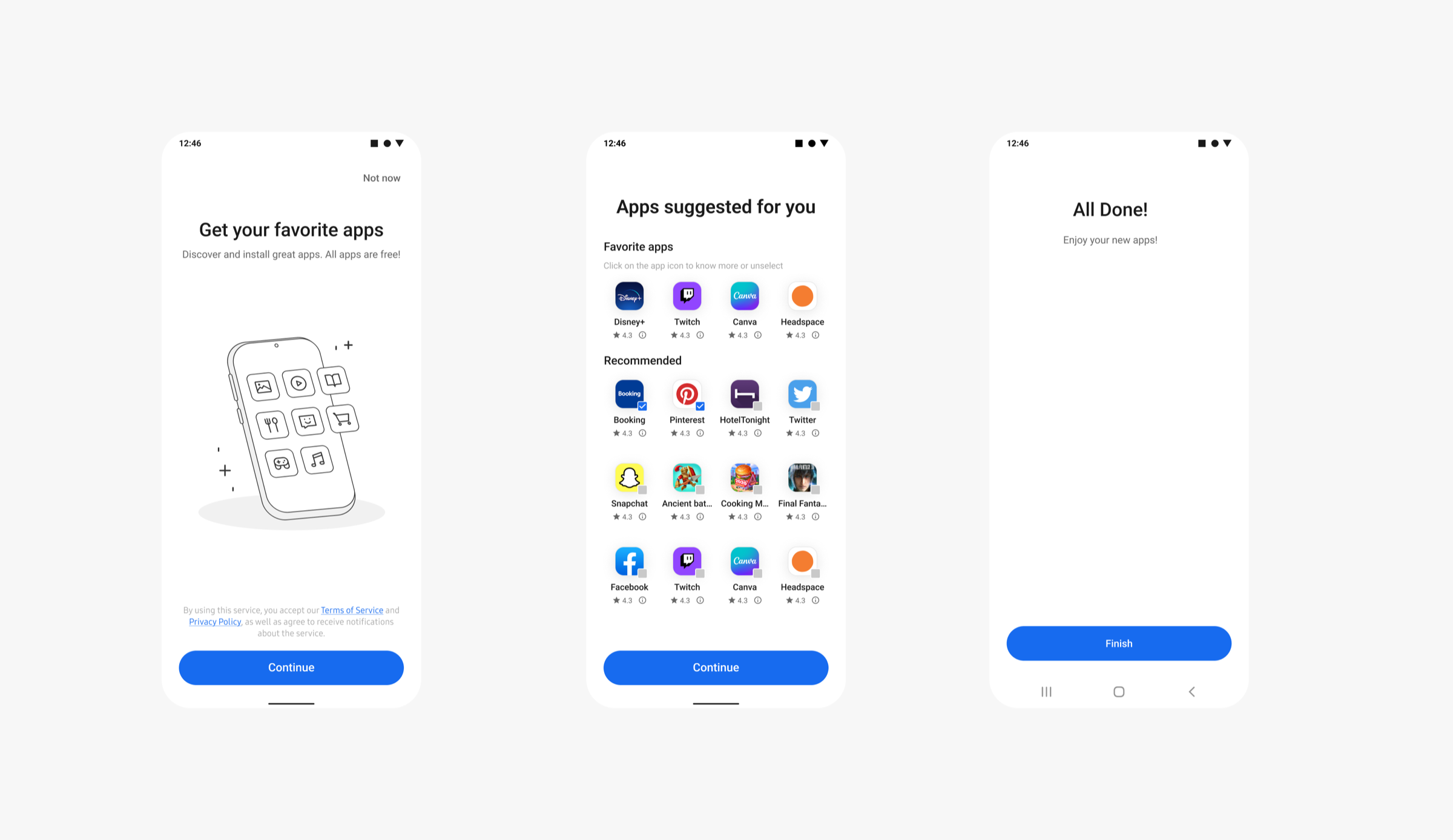
During setup, users see an opt-in page, then a recommendation list where some apps come pre-selected, then a done page. Most users tapped Continue within seconds and never really reviewed what was checked. Installs stayed low, and the signals we had suggested many of them were passive accepts rather than choices.
Most users tap straight through without reviewing a thing
A new phone is the coldest start there is. We knew nothing about the user, the user was in a hurry, and partners like Samsung required every added step to be optional and skippable. So the bet became: spend a few seconds learning preferences first, then make every later screen work harder.
Zero preference signals on a brand-new device, so recommendations often missed.
Setup is a chore. Nobody browses, nobody reads, everybody taps Continue.
Every added step had to be understandable, optional and skippable, by partner requirement.
Install completion also depends on network and system pacing, not just the UI.
Let users express preferences in five quick steps, and recommendations become relevant enough to lift completed installs.
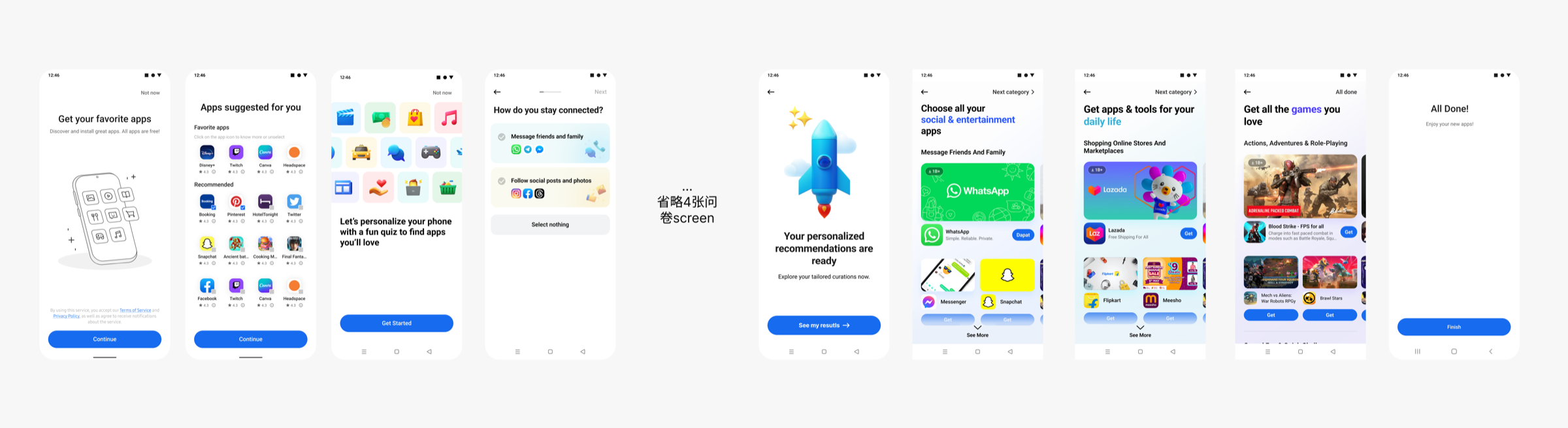
Users were not looking for speed, they were looking for relevance. Leading with social apps instead of games made page one land, and almost everyone who cleared it finished the rest.
Compress the five pages into one, and completion should soar, and installs with it.
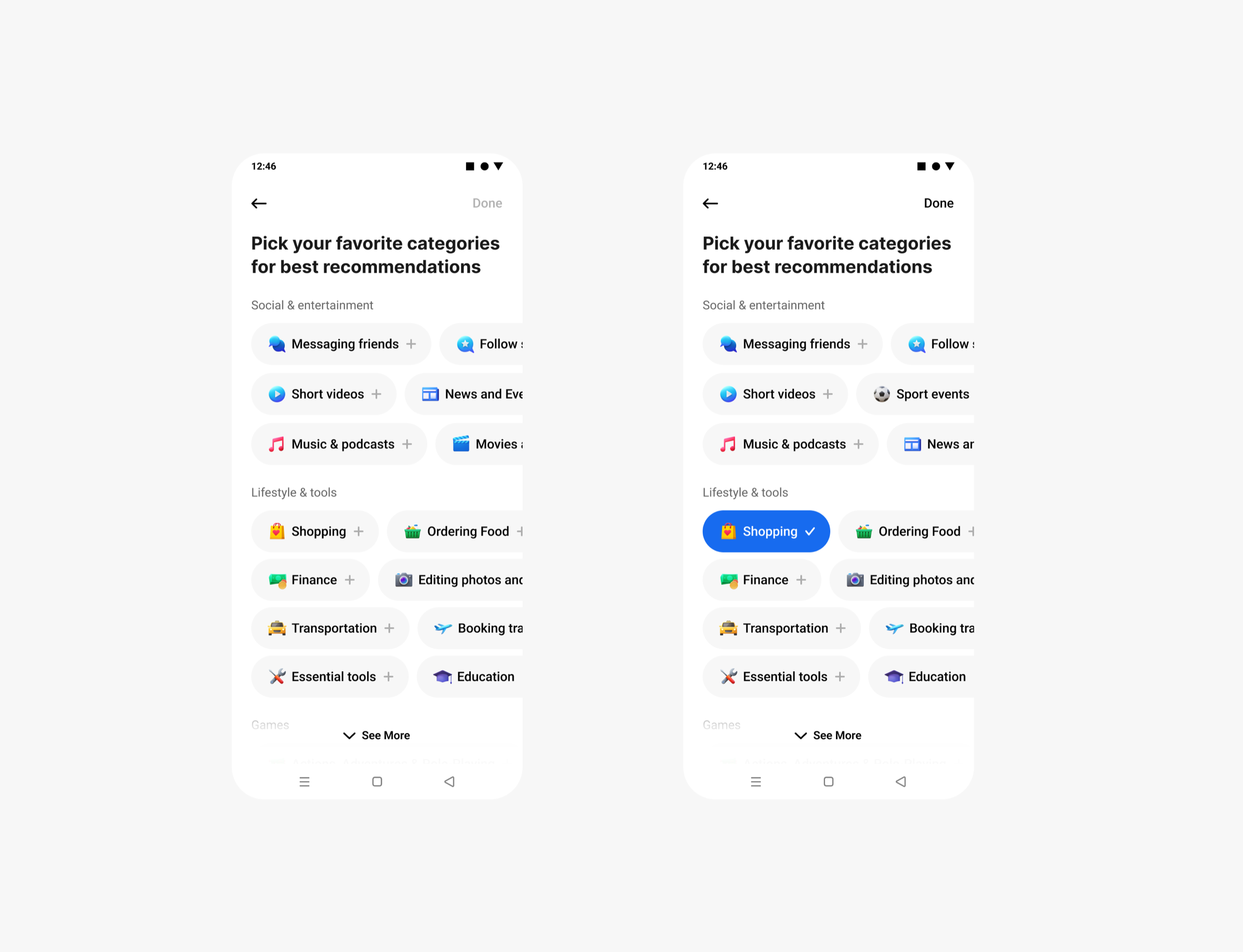
One page finished more surveys. Five steps sold more installs.
Completion jumped, installs did not follow. Five steps warmed users up; one page ended before they started to care. Meaningful friction beat raw speed, so the 5-step survey stayed.
OOBE users want setup done. Package the recommendations into one bundle, cut the decisions, lift the conversions.
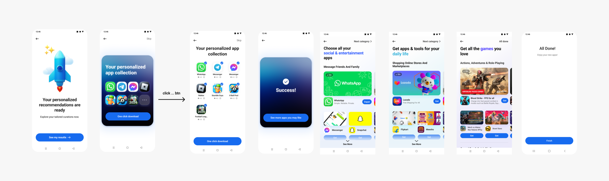

Transparency won. The cleaner collapsed version read as a blind box, and hiding the contents cost more trust than the tidy layout earned. The bundle also front-loaded conversion so hard that it diluted every screen after it.
A list is easy to ignore. A card you must swipe is not. Require one decision at a time, and attention should turn into installs.
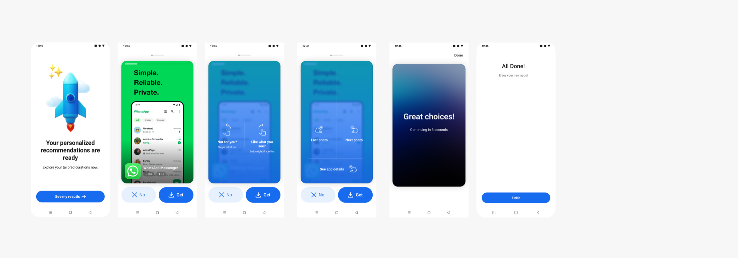
Forced engagement beat free browsing. Swiping made users process each app instead of skimming past a list, and that interaction cost converted lost attention into real clicks and installs.
Because pre-selection inflates raw install counts, the metric that mattered most was CIPEU: completed installs per engaged user. It only counts installs users actively chose. Around it we tracked a small system of checks.
- Completion rate
- CTR
- CIPEU
- Net lift
- Install success rate
- Scroll depth
- Time on page
Meaningful friction beats speed. The 5-step survey out-earned the 1-page version even though fewer people finished it.
Transparency beats minimalism. Showing every app in the bundle beat the cleaner collapsed layout on installs.
Required beats optional, when the value is real. Mandatory swipes produced the highest click-through rate of any track.
Later rounds combined the bundle and swipe models, re-ordered survey options by advertiser mix, and split games into deeper subcategories. Together the tracks form one distribution system: capture intent early, then spend it efficiently.
Want the full experiment ladder, round by round?