MIUI Design System 2.0
Turning a guideline nobody trusted into a system ten thousand employees could build on.
MIUI's design guideline served tens of thousands of employees across dozens of business lines, yet it was kept alive by one or two people. Rules were scattered and incomplete, and most teams had stopped trusting it. Over one year, from mid 2022 to early 2023, I led its upgrade into a system that is complete, sustainable to maintain, and measurable with clear metrics.
- Guideline team lead
- Research and metric definition
- Component guideline authoring
- Figma library rebuild
- Cross-team rollout and reviews
- 7-person guideline group, led by me
- 6 MIUI SDK engineers
- Reported to the head of Xiaomi Design
In December 2021 I took over three things: the guideline website, the Figma component library, and a backlog of long-standing SDK issues. Content was out of date and incomplete, many rules lived only in people's heads, and when the docs disagreed with production, asking an engineer was the only way to learn the truth.
Three artifacts, one part-time owner, no single source of truth
Before writing anything, we compared MIUI against three major design systems, interviewed the people who used ours daily, and ran a co-creation workshop to hear the voices we had missed.
Compared against MIUI, the gap was bigger than expected. Color lived only in Figma styles, and dark mode had no system-level rules at all.
Each walked us through a recent piece of component work: where they looked things up, and where they got stuck.
Designers, researchers and PMs added issues and needs with sticky notes, then voted on what hurt the most.
Instead of trying to fix everything, we focused the year on the four problems that hurt daily efficiency and trust the most.
Nobody knew what MIUIX was, or when to use the component library.
Build a MIUI knowledge base, linked with engineering docs.
Resources were scattered across Figma, the website and platforms, with no links between them.
Rebuild the Figma library with a clear linking system.
Key rules were missing and nothing followed a standard structure.
Standardize the document and Figma framework.
Figma and shipped results often disagreed, so people stopped trusting both.
Partner with engineering to keep content true to what ships.
I rewrote the dialog guideline as a pilot, borrowing the structure we learned from benchmarking, and put it through two review rounds: first 9 close readers, then 30 testers scoring it against the quality metrics we defined along the way.
- Comprehensive and reliable
- Easy to read and learn
- Clear customization boundary
- Clear ownership and change log
- Consistent across Figma, docs and code
Phase 1 rebuilt the highest-frequency components, with every rule aligned with the SDK team: button, switch, list, floating window, reach-friendly dialog, loading, empty state and input field. Foundation guidelines for color, typography, type scale and motion were published for the first time.
Every component doc now follows the same seven-part anatomy:
- 01Links & overview
- 02Types & scenarios
- 03Anatomy
- 04Responsive rules
- 05Interaction rules
- 06Do's and don'ts
- 07Change log & customization
From styles to tokens
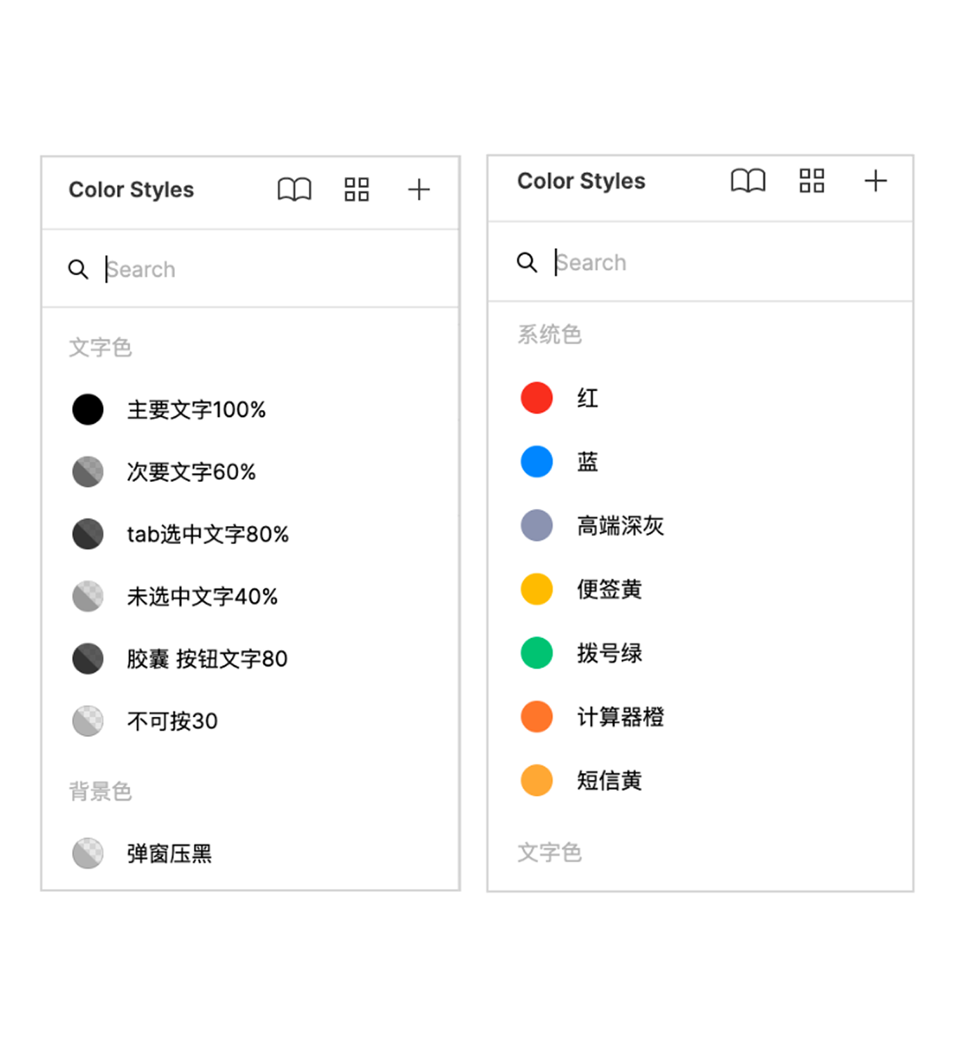
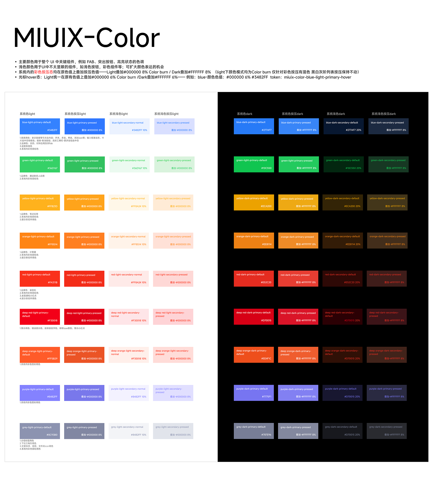
Color used to exist only as Figma styles. We rebuilt it as design tokens, with default, pressed, hover and disabled states defined across light and dark.
From working file to documented spec
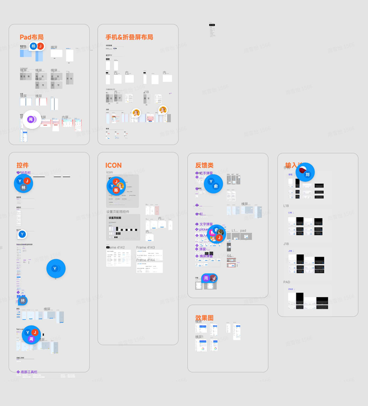
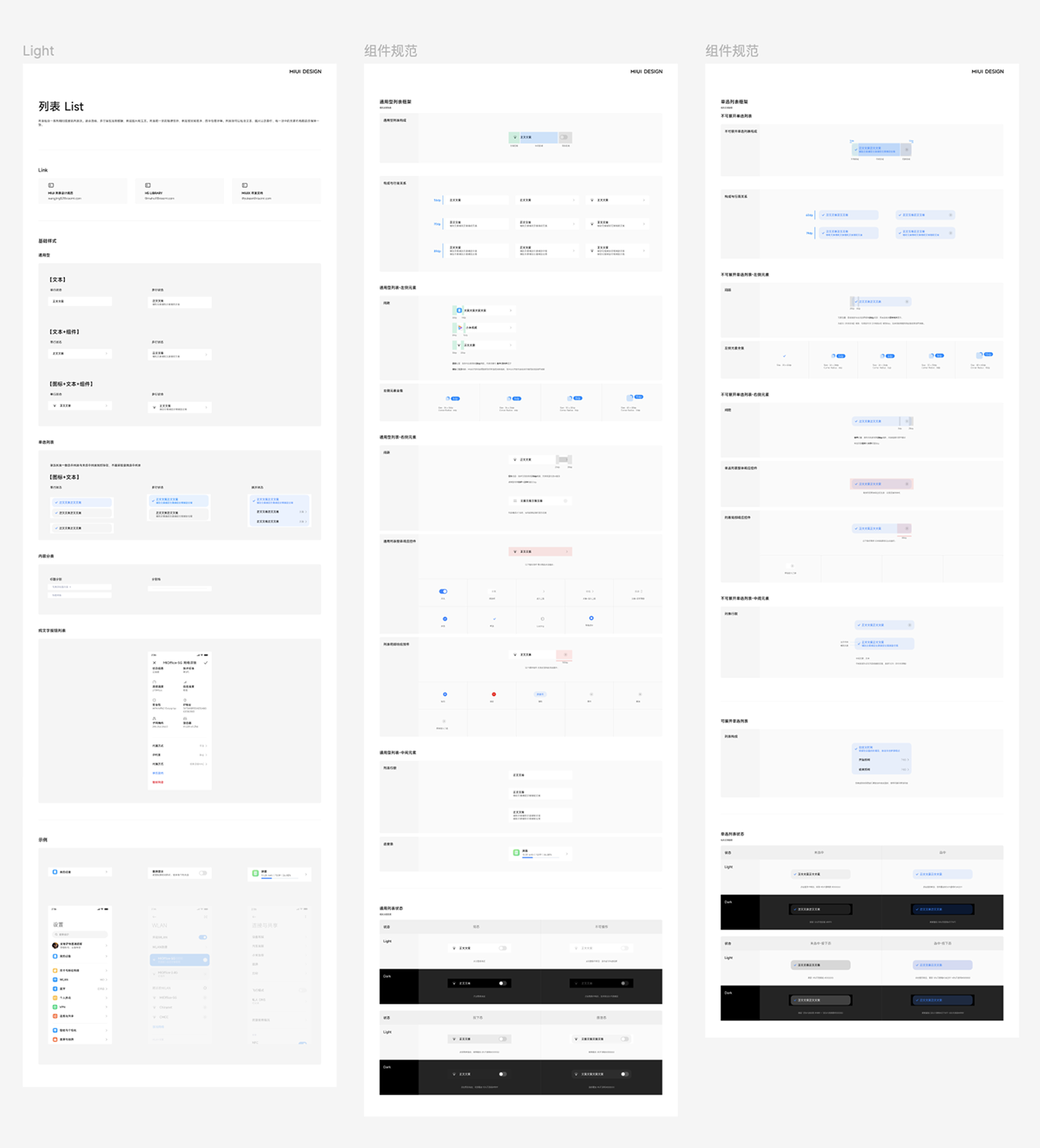
The old library piled everything into a few crowded pages. The new one is indexed, split per component, built on Auto Layout and variants, and every rule is written down.
From hidden bugs to global standards
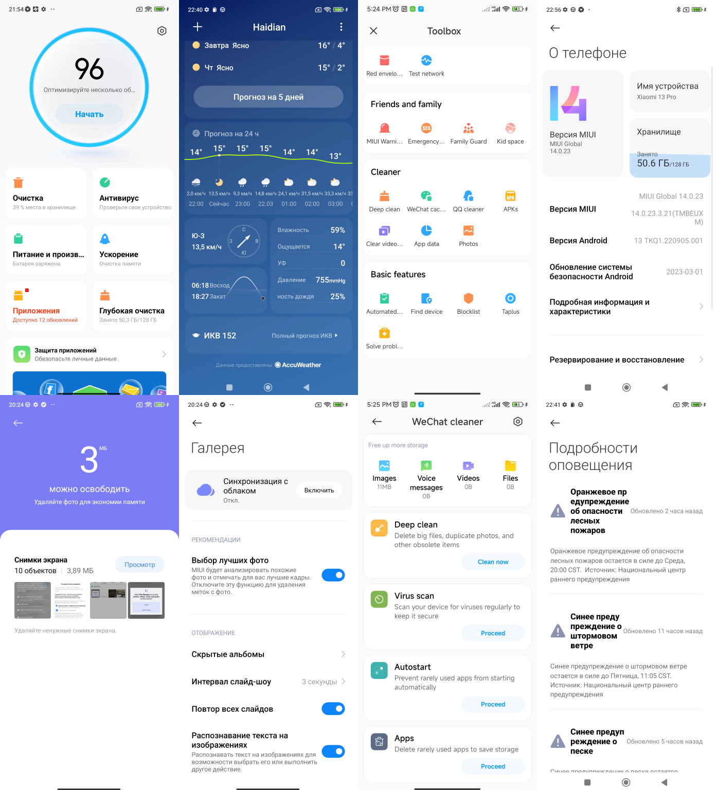
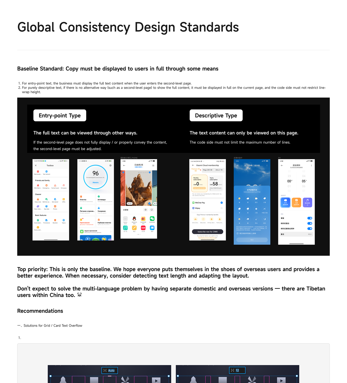
Long-standing large-text and multi-language issues became a written global consistency standard, so every user sees the full content instead of a truncated version.
“We appointed a newcomer to lead a group of senior people, and it had to be cross-department. It sounded very unreliable.”My manager, joking, before it worked
Most of what we achieved came from fast learning loops, leadership trust, and a team that genuinely wanted a better system.
Want the story behind the numbers?