






Onboarding survey
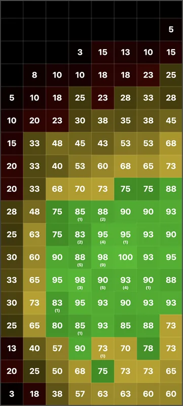
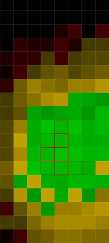
5-step survey drove 18% install growth. 1-step only drove 14%.
1 step
WINNER5 step
Longer engagement built stronger intent.
A UX/Product Designer with experience at Xiaomi, AppLovin, and Huawei. Now Head of Product at a startup.
Designing for millions, for business, for teams, and out of plain curiosity.
It means ‘just make it bigger’ is never the answer.
It means there's always another kind of design waiting to be made.
The OOBE app-recommendation flow ships with Samsung, T-Mobile, and a dozen other OEMs. It reaches tens of millions of newly unboxed phones each quarter and contributes seven figures of revenue.





“Fewer steps is always better.”
“Cleaner UI converts more.”
“Users hate being forced.”
We tested all three. All three were wrong.
5-step survey drove 18% install growth. 1-step only drove 14%.
Longer engagement built stronger intent.
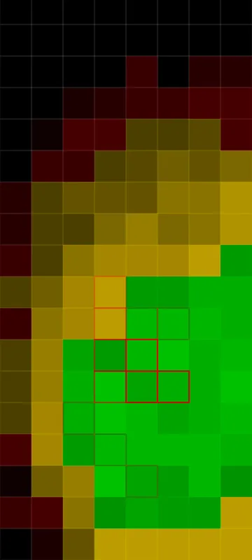
Showing all app icons lifted installs by 0.47 per user. Collapsed view only lifted 0.37.


Transparency beat minimalism.
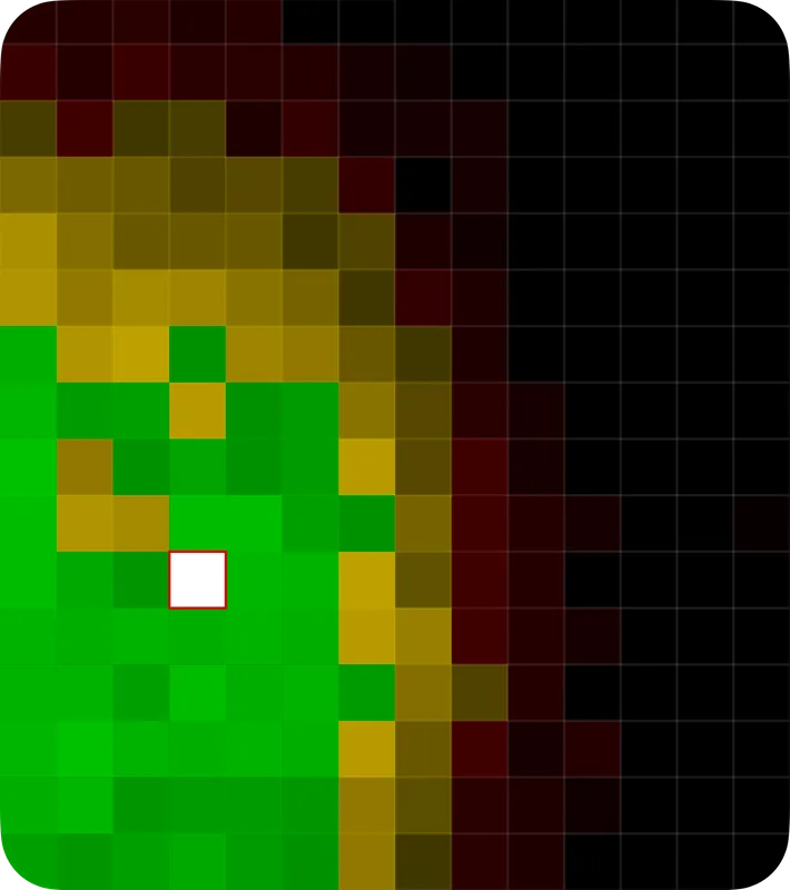
Swipe cards reached 15.65% CTR. Free-scroll list stayed much lower.


Forced focus beat open browsing.
My manager said this when he put me in charge of the design system:
“We just put a newcomer in charge, leading a team of senior people, across multiple departments. Honestly? It sounded like a idea.”