Touch Hot Zone
Mapping where thumbs actually reach on a 6.8-inch screen, so layout decisions stop being guesses.
The first HCI design research project initiated by the design department at Xiaomi. We measured how thumbs really perform across today's large screens, turned the data into a hot zone map designers use daily, and packaged the method so it could be rerun on foldables and tablets.
- User research
- Experimental design
- Data analysis
- User experience design
- 2 UX designers
- 1 user researcher
- First research project by the design team
Steve Jobs called 3.5 inches the perfect size. Since 2012 screens kept growing anyway, and Xiaomi's bestsellers now run about 6.8 inches. Our thumbs did not grow with them, yet most layout rules still assumed they had.
Screens doubled. Thumbs didn’t.
The study aimed at three deliverables:
- 01A touch hot zone map designers can use daily
- 02Design guidance Xiaomi's business teams can apply
- 03A replicable method for foldables and tablets
Desk research surfaced two dominant single-hand grips, pinky supporting the back of the phone or catching its bottom edge. We scoped the study tightly so the data would stay credible on a limited budget.
Two grips, two thumb anchors, two different maps · 20 participants each
- Xiaomi 11 · 6.8 in
- Single-hand use
- Thumb clicking
- Seated, stationary
- Left and right hands
- 50 / 50 gender split
We split the screen into 144 zones sized from Apple's ideal 9 by 9 millimeter target. In each zone, participants long-pressed a square, waited for it to turn green, then tapped it. 40 people, 20 per grip style, ran the task with both hands after 10 practice rounds.
One protocol, 144 zones, five metrics per zone
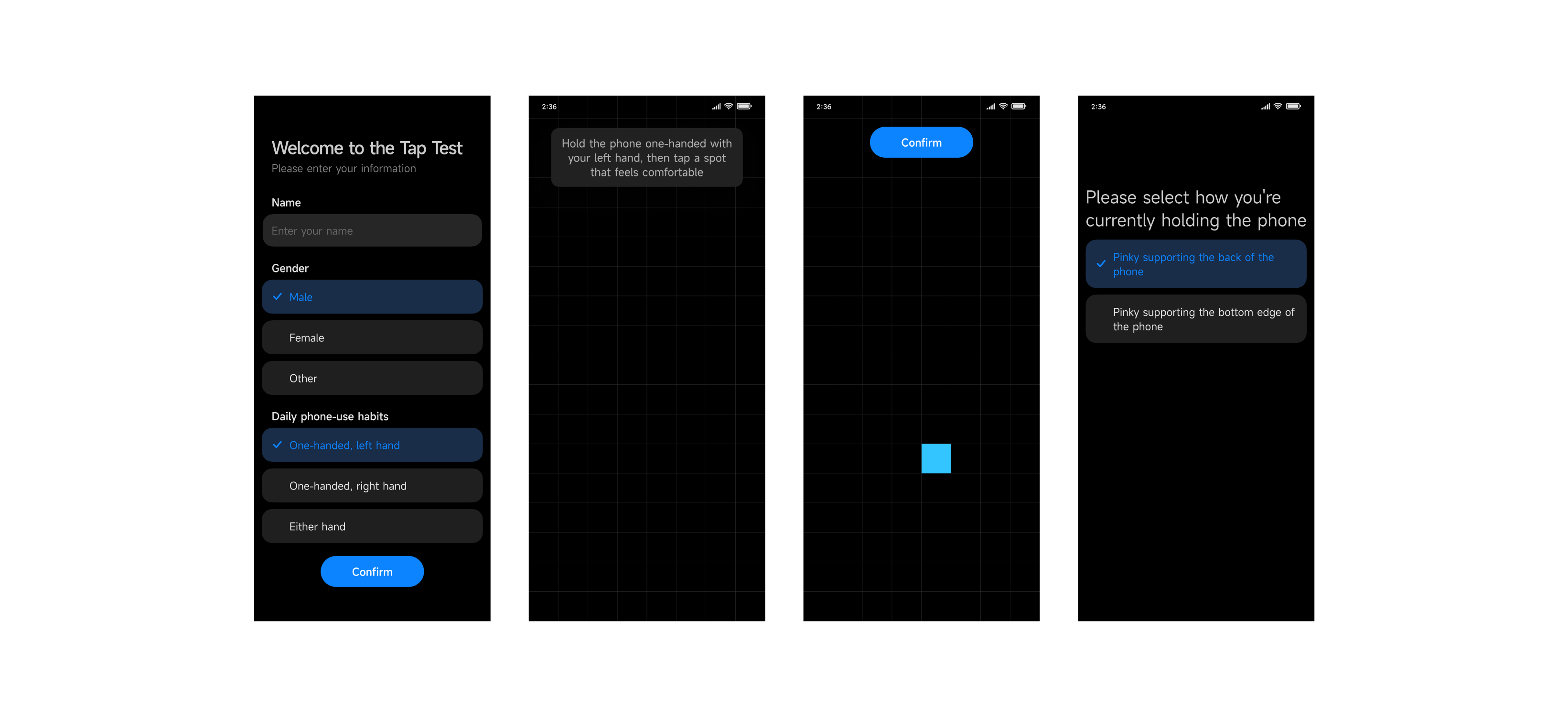
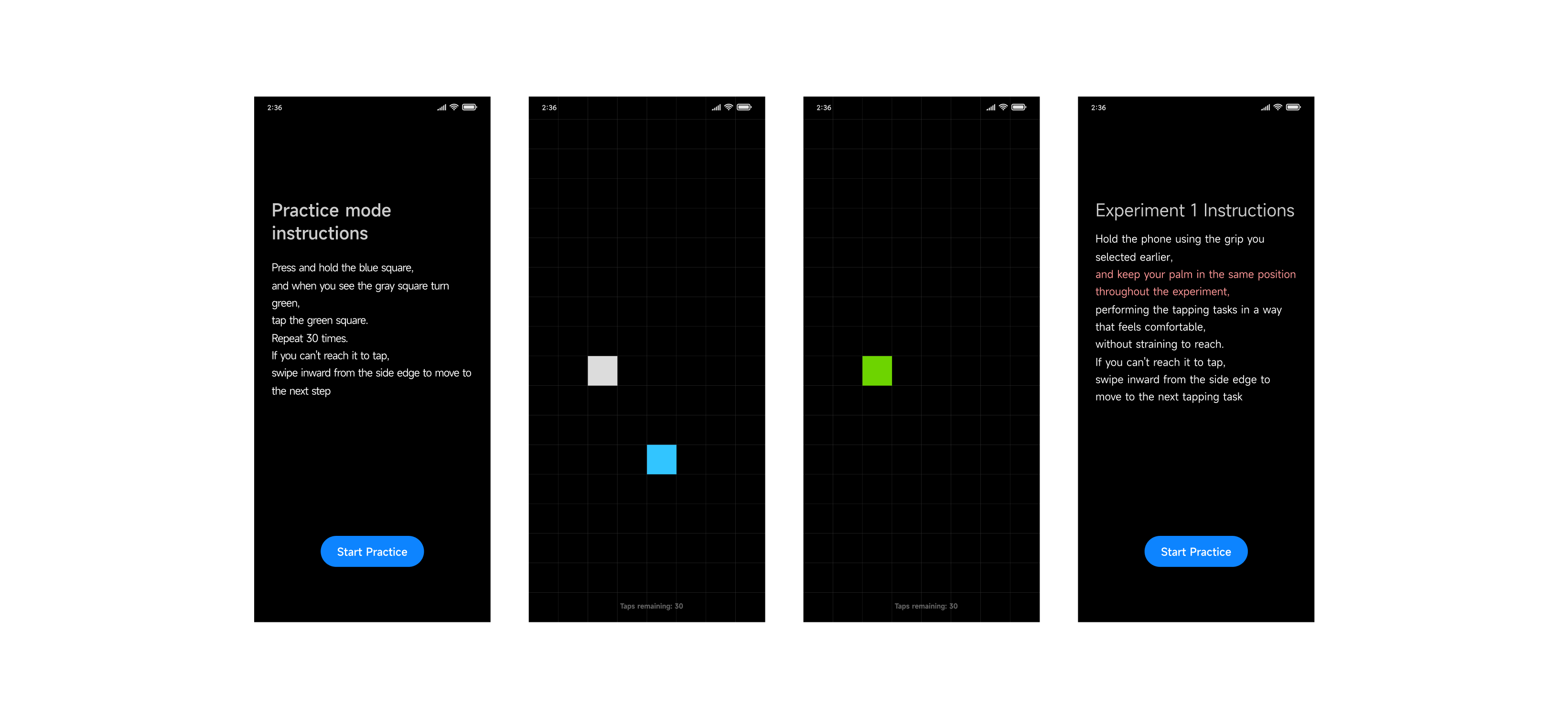
Five metrics were collected for every zone:
- Hit rate
- Abandon rate
- Misoperation rate
- Click duration
- Click offset
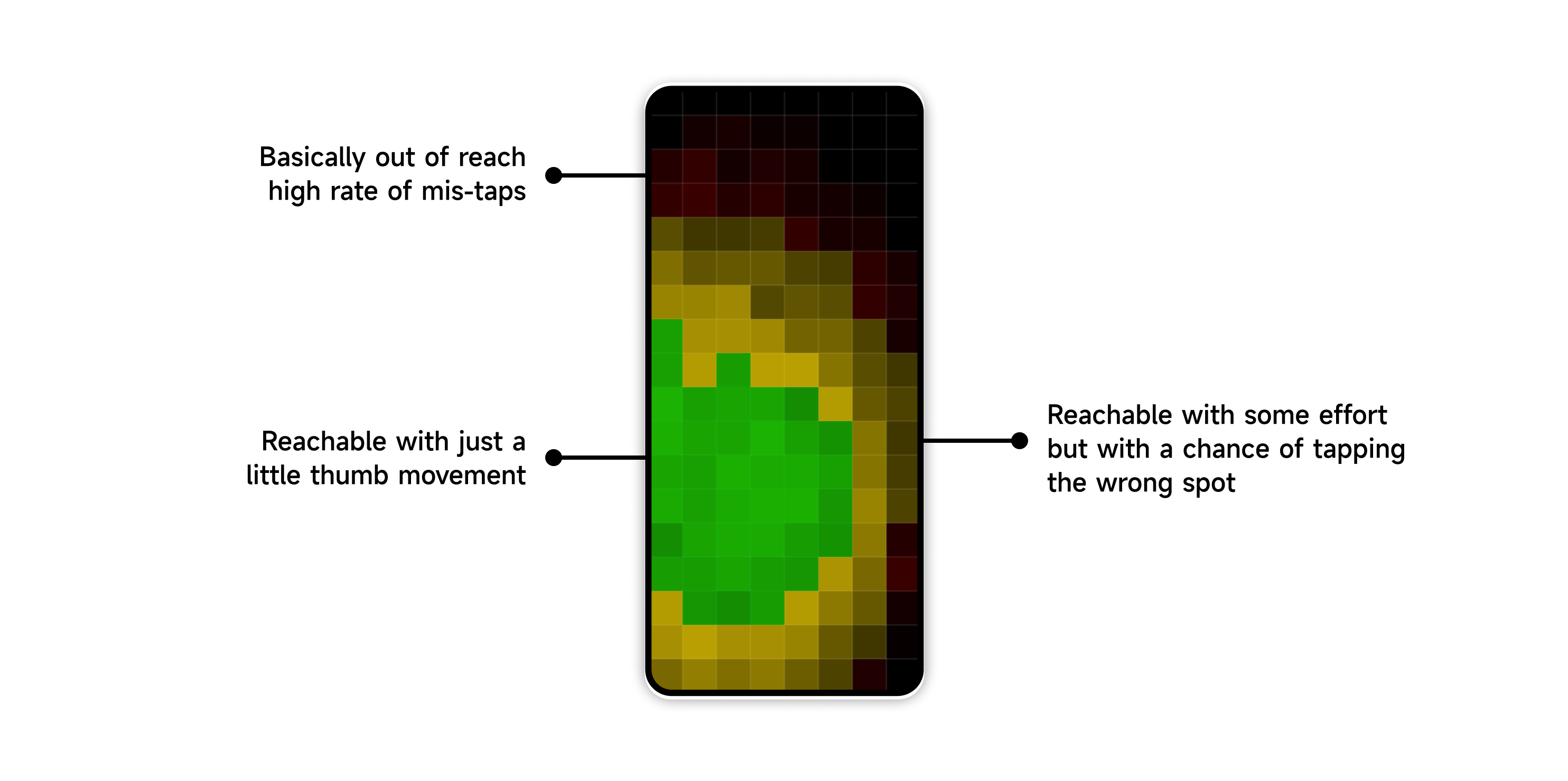
Per-zone hit rates fell into three clean bands: an easy zone under the thumb's natural sweep, a stretch zone reachable with effort, and a dead zone the thumb abandons. The maps below are the real data, first how to read one, then both hands side by side.
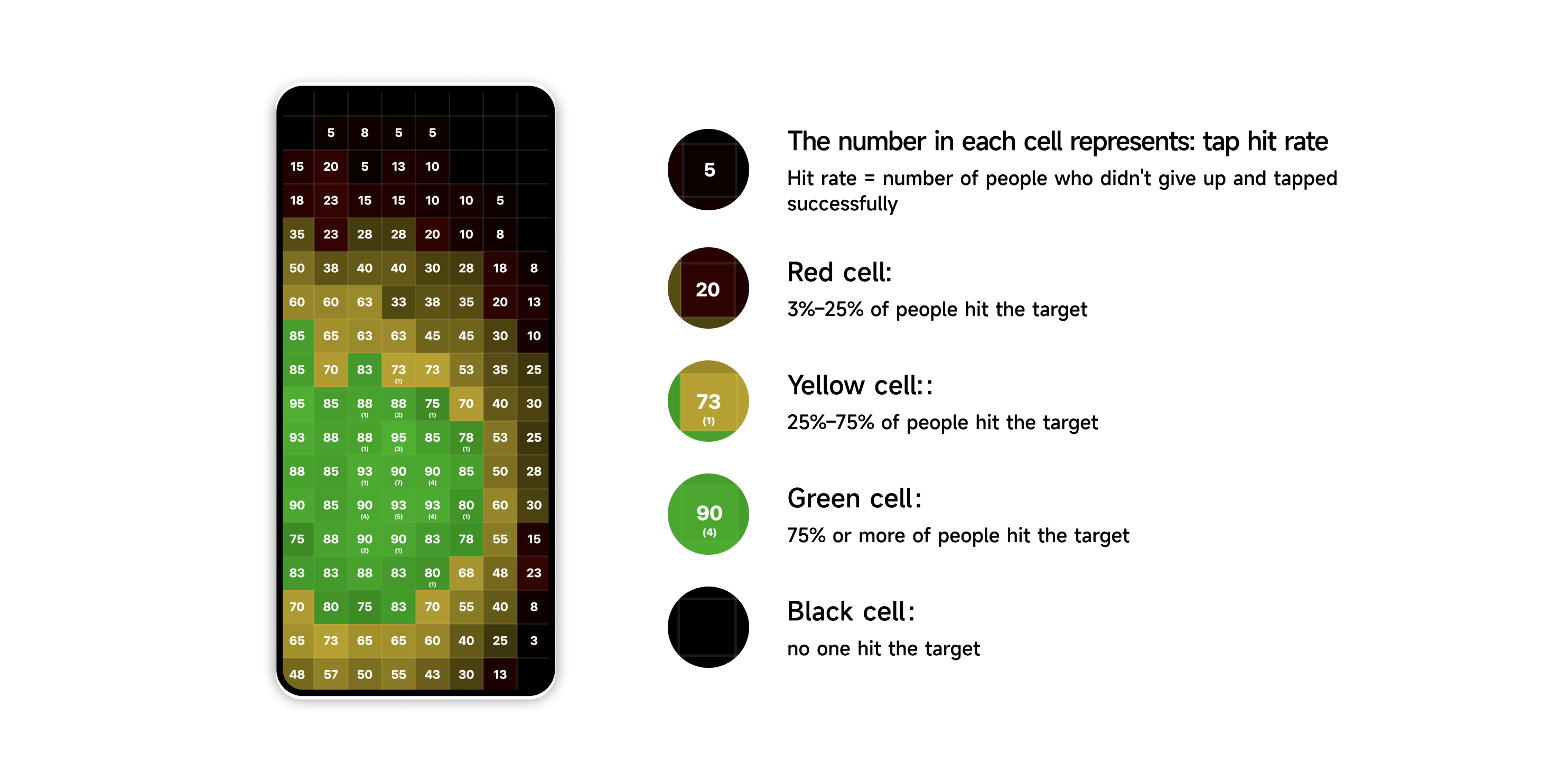
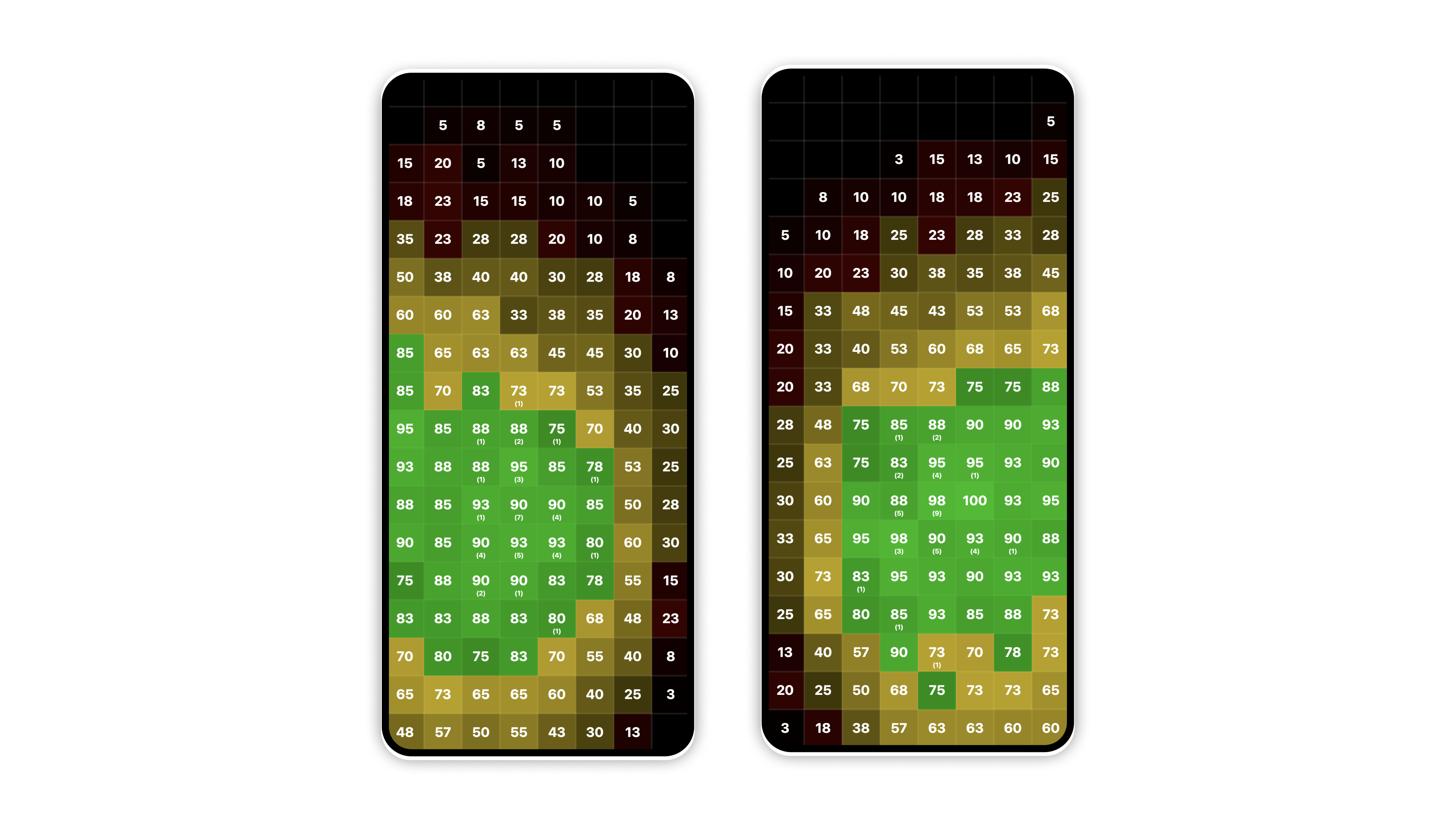
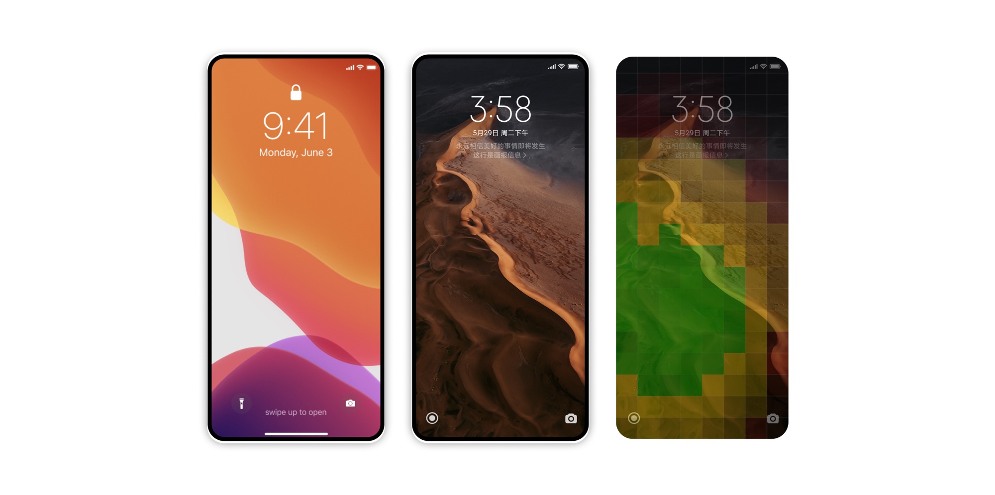
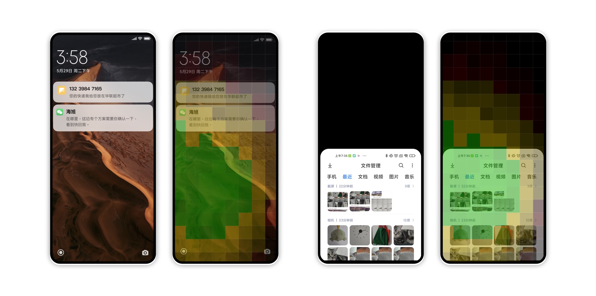
We turned the map into design guidance and audited MIUI screen by screen, overlaying the zones on real UI to check where every control lands. The lock screen shortcuts, notifications and the file manager below are a small sample of that review. The full guidance covered static fixes, moving controls into the easy zone, and whole-flow redesigns, with the biggest win, bottom tab navigation replacing top tabs, launching in MIUI 15.
“3.5 inches is the perfect size for consumers' hands.”Steve Jobs, 2010. Screens kept growing anyway.
The findings were shared across design, product and research teams, and the method became the template for the folding screen, gesture and eye-tracking studies that followed.

Want the full dataset and method?